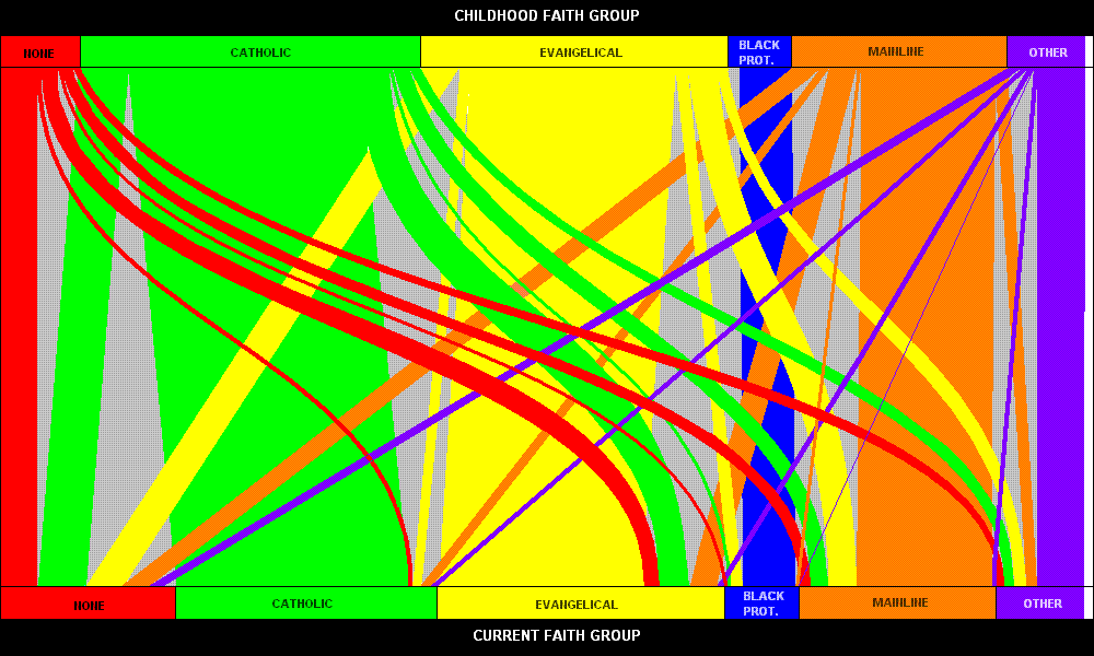
This chart displays graphically the inflow and outflow of people in various religious groups in America.

This graph is taken from a post by internet monk. It was compiled from two surveys recently released detailing the state of religion in America. The most influential is the Pew Forum study Faith in Flux. The upshot of the above graph for Evangelicals is summarized by internet monk as:
Evangelicals are at best currently treading water. Their inflows have been matched by outflows, albeit coming from different sources. Much to my surprise, Evangelicals and Mainline Protestants have in fact been swapping members, I had expected much more of a move from Mainline Protestants to Evangelicals. This has not been the case as 2.6% of Americans have moved from Evangelical to Mainline and 2.5% have moved back the other way. More on this later in the post.
Evangelicals have gained 2.8% in moves from the Catholics, and 1.6% in moves from the None group, but have also had 3.5% of their group move to the None group and 0.8% move to Catholics. These moves have largely offset each other as well.
A total of 1.1% has moved to the Historical Black Protestant group (blue), which I will discuss in greater detail when discussing this group. 1.1% have also moved to the “Other Religions” (purple) group which has only been replaced by 0.5% coming back the other way.
I find this fascinating. I’ve heard lots of reports about Mainline and Catholic churches not growing, but this is the most concrete evidence of the same phenomenon occurring in the Evangelical church. This data points to a trend away from the evangelical church at a rate equal to any new growth.
When I first saw this post I felt vindicated. Much of the broader evangelical culture is a complete turn off for me. This graph shows that I’m not alone. This also encourages me as a pastor to keep thinking about new and fresh ways to live out the gospel for the growing number of people who share my experience with Evangelical culture.
Comments
2 responses to “Evangelical Church is at best treading water”
Interesting. Though I find the graph unintelligible, looks more like modern art, which I actually like.
[…] religious demographic called the Coming Age of the Nones. I’ve blogged about this before (here and here). He has some great insights. He sets the stage with these statistics: In 1990, 8 […]